您现在的位置是:网站首页> 编程资料编程资料
CSS3 input框的实现代码类似Google登录的动画效果css3中transform属性实现的4种功能详解CSS3.0(Cascading Style Sheet) 层叠级联样式表纯CSS3实现div按照顺序出入效果CSS3实现列表无限滚动/轮播效果css3 利用transform-origin 实现圆点分布在大圆上布局及旋转特效CSS3实现的侧滑菜单CSS3实现的3D隧道效果用CSS3画一个爱心css3 实现文字闪烁效果的三种方式示例代码六种css3实现的边框过渡效果
 2021-09-03
1011人已围观
2021-09-03
1011人已围观
简介 这篇文章主要介绍了CSS3 input框的实现代码类似Google登录的动画效果,本文通过实例代码给大家介绍的非常详细,对大家的学习或工作具有一定的参考借鉴价值,需要的朋友可以参考下
用css3将input框写出类似Google登录页面的动画效果
效果一
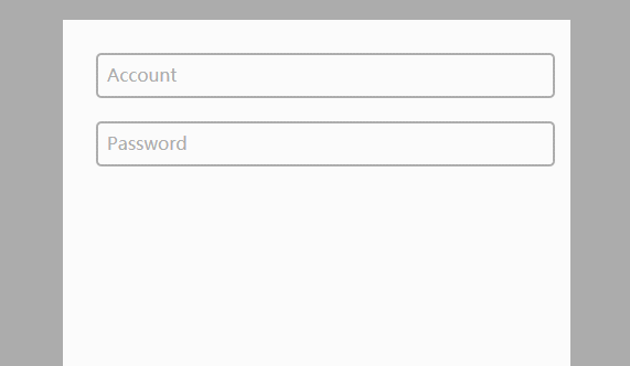
代码如下
CSS
body{ background-color:#acacac; } .form-container{ display: block; position: relative; width: 400px; height: 400px; background: #fff; margin: 50px auto; padding: 30px; } input{ display: block; position: relative; background: none; border: 2px solid #acacac; border-radius:5px; width: 100%; font-weight: bold; padding-left:10px; font-size: 16px; height:35px; z-index: 1; } label{ display: inline-block; position: relative; top: -32px; left: 10px; color: #acacac; font-size: 16px; z-index: 2; transition: all 0.2s ease-out; } input:focus, input:valid{ outline: none; border: 2px solid #00aced; } input:focus + label, input:valid + label{ top: -50px; font-size: 16px; color: #00aced; background-color:#fff; }HTML
效果二
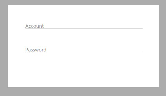
代码如下:
CSS
body{ background-color:#acacac; } .form-container{ display: block; position: relative; width: 400px; background: #fff; margin: 50px auto; padding: 60px; } input{ display: block; position: relative; background: none; border: none; border-bottom: 1px solid #ddd; width: 100%; font-weight: bold; font-size: 16px; z-index: 2; } label{ display: block; position: relative; top: -20px; left: 0px; color: #999; font-size: 16px; z-index: 1; transition: all 0.3s ease-out; margin-bottom:40px; } input:focus, input:valid{ outline: none; border-bottom: 1px solid #00aced; } input:focus + label, input:valid + label{ top: -50px; font-size: 16px; color: #00aced; background-color:#fff; }HTML
总结
到此这篇关于CSS3 input框的实现代码类似Google登录的动画效果的文章就介绍到这了,更多相关CSS3 input框内容请搜索以前的文章或继续浏览下面的相关文章,希望大家以后多多支持!
相关内容
- 详解flex布局与position:absolute/fixed的冲突问题使用Flex布局实现头部固定内容区域滚动的方法详解flex布局下图片变形的解决方法Flex布局实现div内部子元素垂直居中的示例Flex布局让子项保持自身高度的实现让CSS flex布局最后一行列表左对齐的N种方法(小结)css3 flex布局实现平均分配元素的示例代码flex布局实现上下固定中间滑动的布局方式flex是什么及flex布局语法教程详解
- Flex布局实现div内部子元素垂直居中的示例使用Flex布局实现头部固定内容区域滚动的方法详解flex布局下图片变形的解决方法详解flex布局与position:absolute/fixed的冲突问题Flex布局让子项保持自身高度的实现让CSS flex布局最后一行列表左对齐的N种方法(小结)css3 flex布局实现平均分配元素的示例代码flex布局实现上下固定中间滑动的布局方式flex是什么及flex布局语法教程详解
- Flex布局让子项保持自身高度的实现使用Flex布局实现头部固定内容区域滚动的方法详解flex布局下图片变形的解决方法详解flex布局与position:absolute/fixed的冲突问题Flex布局实现div内部子元素垂直居中的示例让CSS flex布局最后一行列表左对齐的N种方法(小结)css3 flex布局实现平均分配元素的示例代码flex布局实现上下固定中间滑动的布局方式flex是什么及flex布局语法教程详解
- 纯CSS3+DIV实现小三角形边框效果的示例代码详解css如何利用 :before :after 写小三角形CSS3 画基本图形,圆形、椭圆形、三角形等用CSS3绘制三角形的简单方法布局和排版教程 纯css3实现图片三角形排列使用css创建三角形 使用CSS3创建3d四面体原理及代码(html5实践)CSS3实现三角形不断放大效果
- 详解CSS文件中的4种引入方式:行内,内联式,外部式,导入式css样式引入方式及优缺点介绍关于CSS引入方式的详细见解小结详解CSS文件的三种引入方式html引入css四种引入方式示例分享Css基本概念及其引入方式介绍
- 利用transform实现一个纯CSS弹出菜单的示例代码纯CSS(无JS)实现的二级弹出菜单效果代码符合标准的div css制作的弹出菜单-CSS教程-网页制作-网页教学网
- css counter计数器与content总结CSS黑魔法之计数器counter的使用技巧CSS计数器counter()的用法简介
- CSS 列表模型之marker标记的使用浅谈CSS 伪元素&伪类的妙用什么是BFC? CSS 使用伪元素清除浮动的方法CSS :befor :after 伪元素的巧妙用法CSS3中伪元素::before和::after的用法示例CSS 伪元素::marker详解
- 让CSS flex布局最后一行列表左对齐的N种方法(小结)CSS字体、文本、列表属性详细介绍CSS 有序或者无序列表的前面的标记 list-style-type 属性的实现css中有序无序列表项list样式设置方法CSS如何设置列表样式属性(看这篇文章就够用了)css列表滑动防止被底部遮住和适配屏幕长一点的机型处理 纯CSS实现页面中的列表收拉效果
- 解决移动端1px边框最好的方法(推荐)解决移动端1px边框问题的几种方法(5种)详解移动端Html5页面中1px边框的几种解决方法reset.css引入以及1px边框问题的解决方法